Divvy Cycling Data - 2014
This data was released in early 2014 and was originally a quick look at it. This post may seem familiar if you followed my previous website and that is because it was posted on there.
Unfortunately, at the time the data was obtained it is not clean. This is nothing new and sort of expected, so a few steps had to be taken to clean up the data first.
Data Clean Up
After reading in the csv file, the function summary was applied to it. From this, trip_id, bikeid, birthyear can be seen as numerical columns but from_station_id, to_station_id and tripduration are showing as character columns where they should be numerical as well.
Taking a look at each:
tripduration had a “,” in anything greater than 100 such as 1,000.
from_station_id and to_station_id had a “#N/A” for station at Congress Pkwy & Ogden Ave Customer. This was fixed by giving this station its own id number.
The last bit of clean up was setting the starttime and endtime to yyyy-mm-dd instead of dd/mm/yyyy.
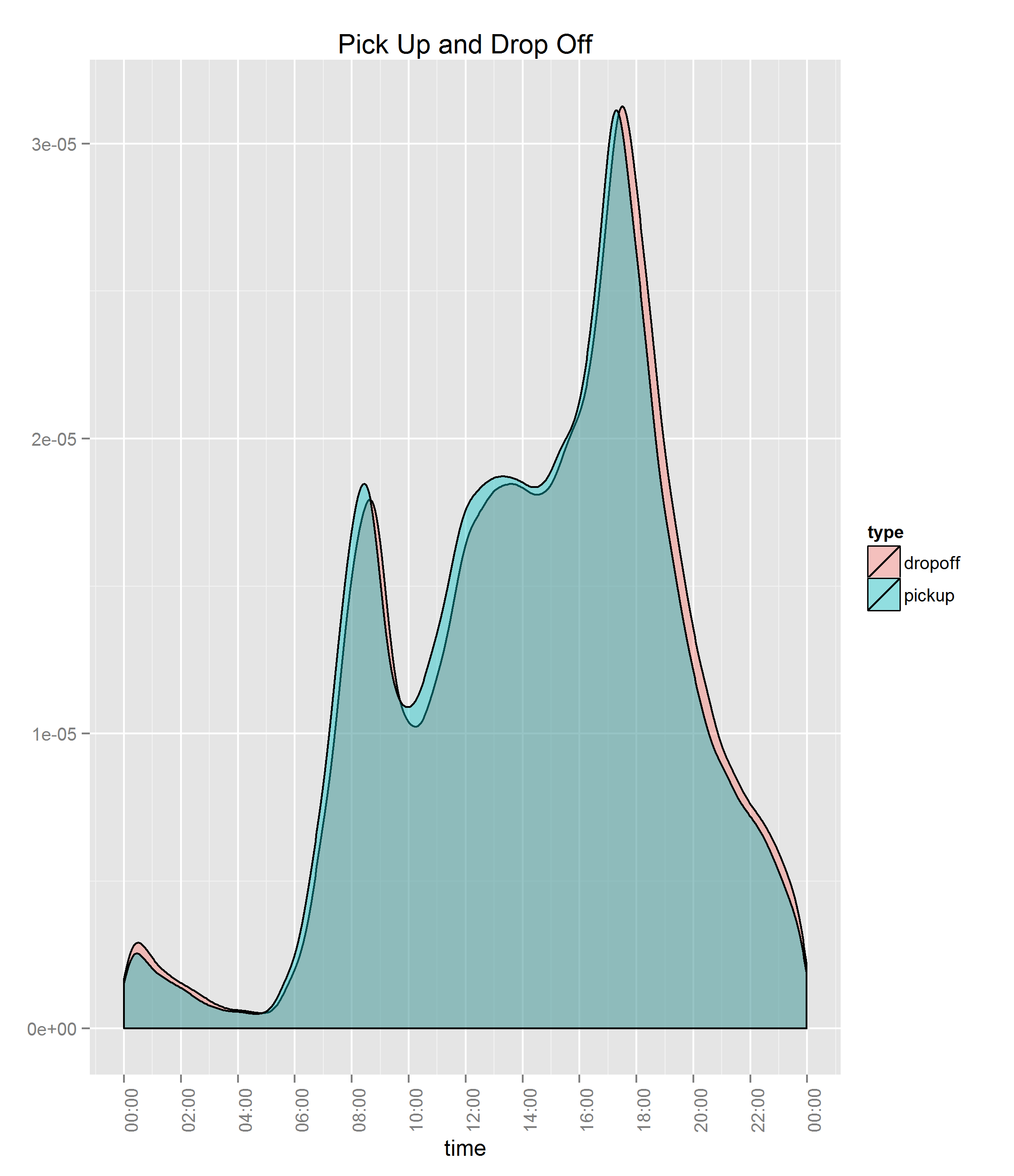
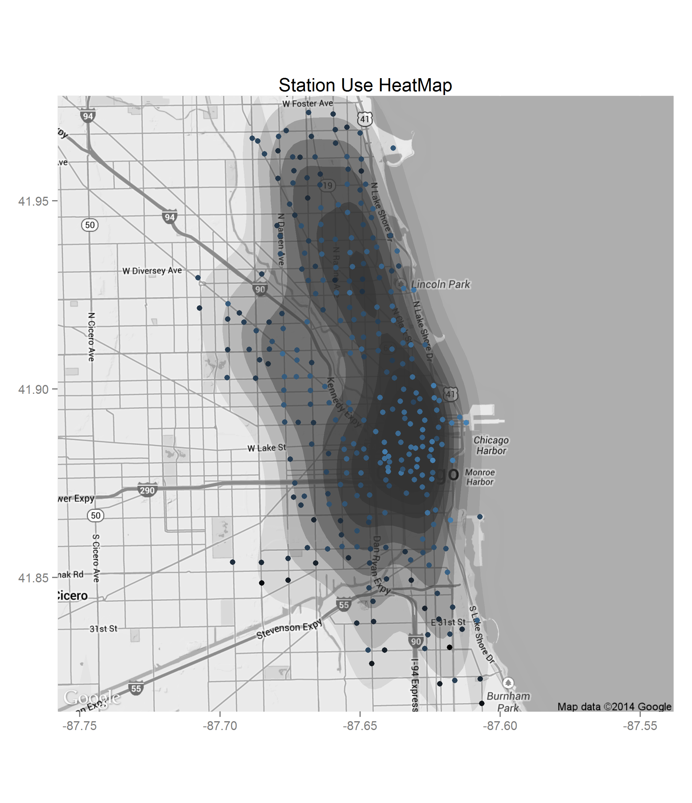
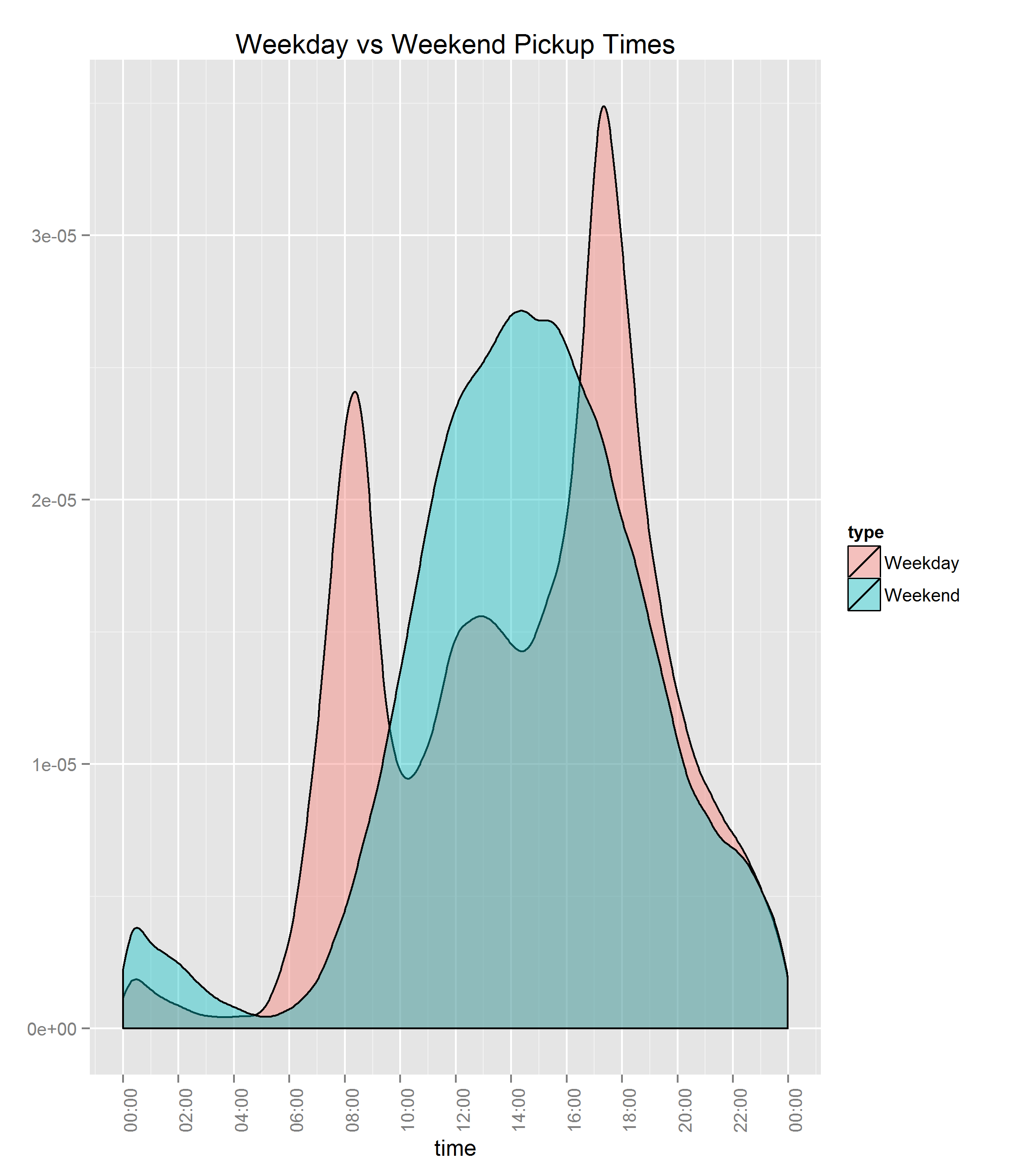
Visualization
This was not meant to be an in depth look but just a few plots to see the data quickly.


Notes
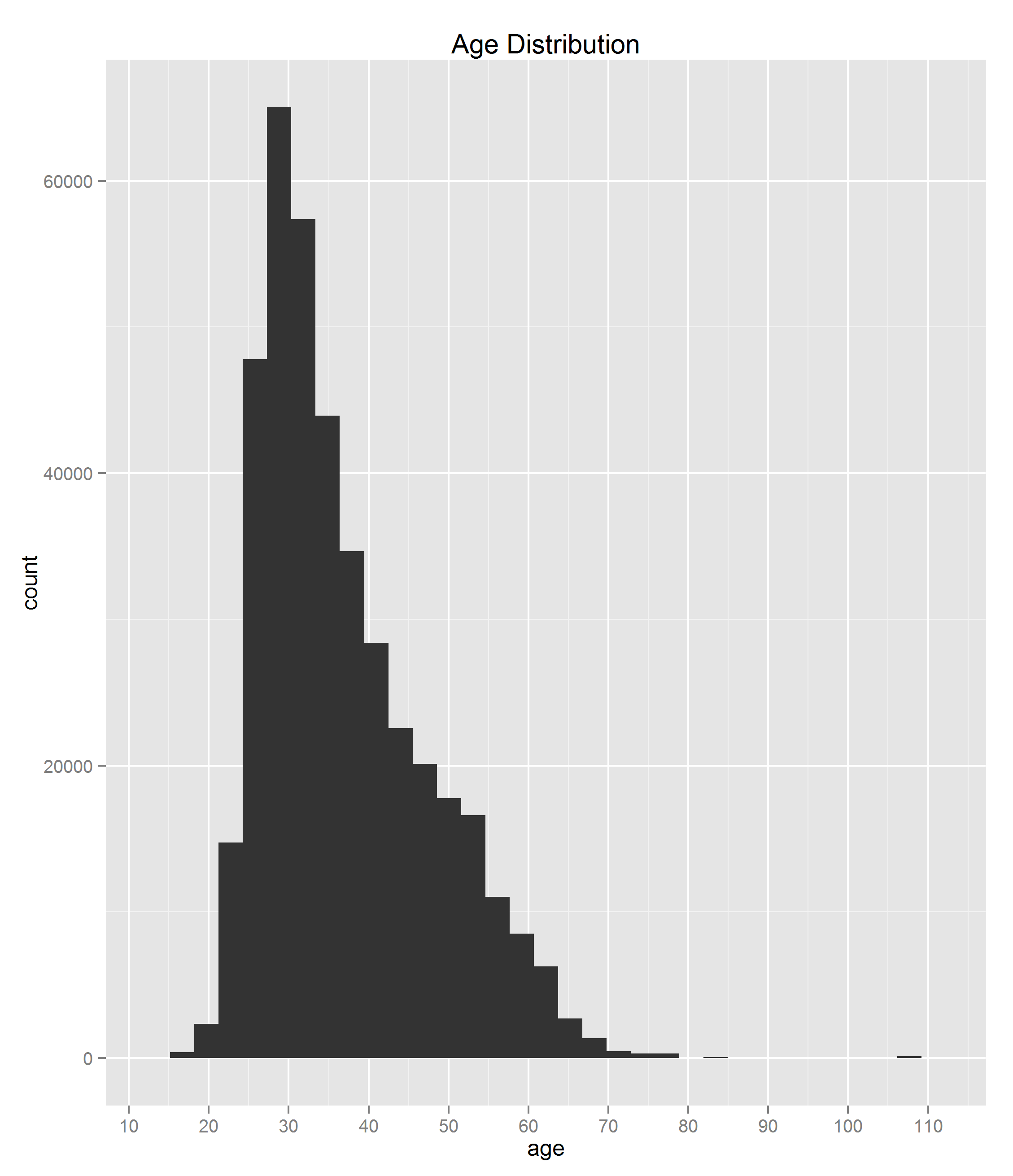
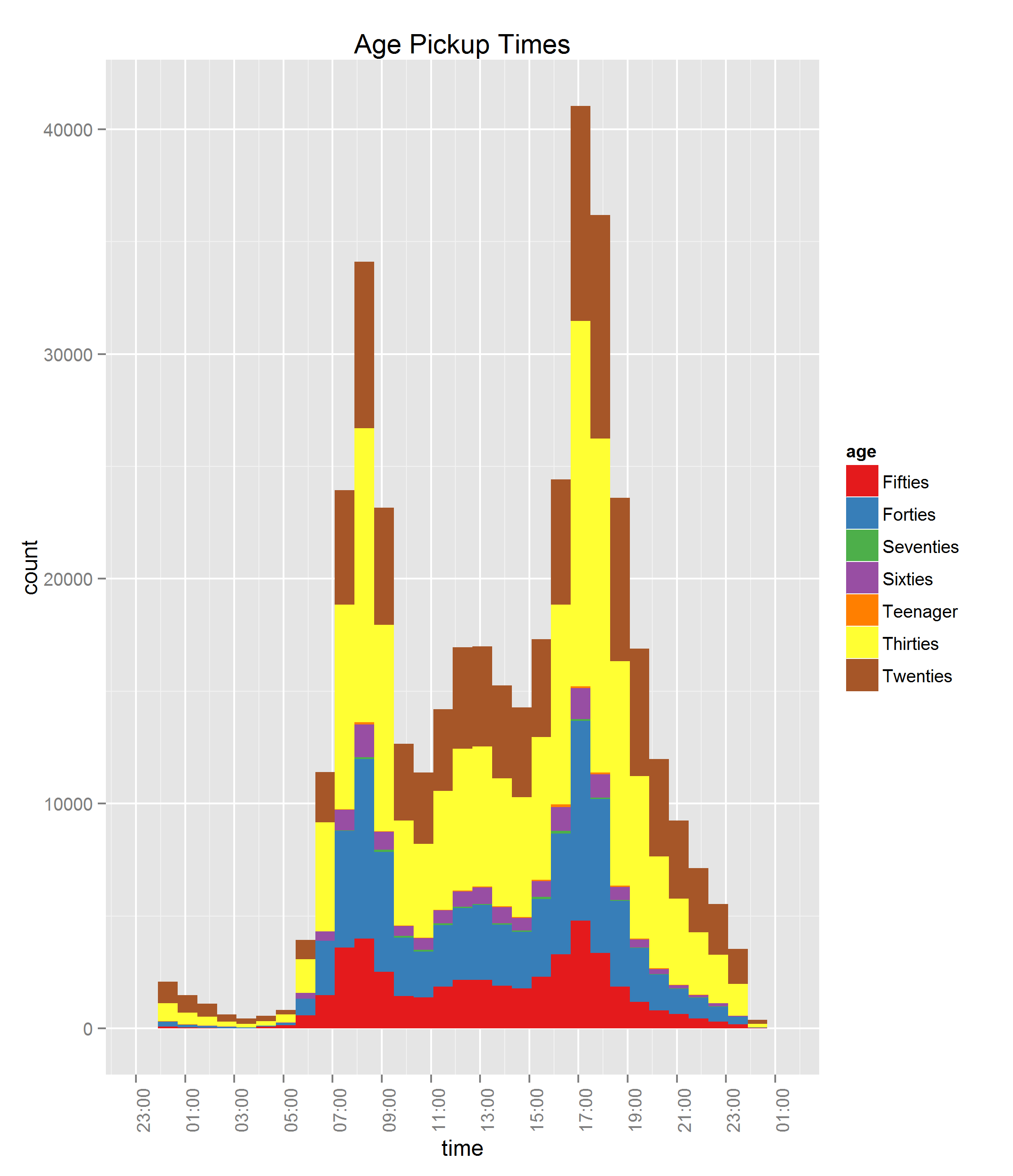
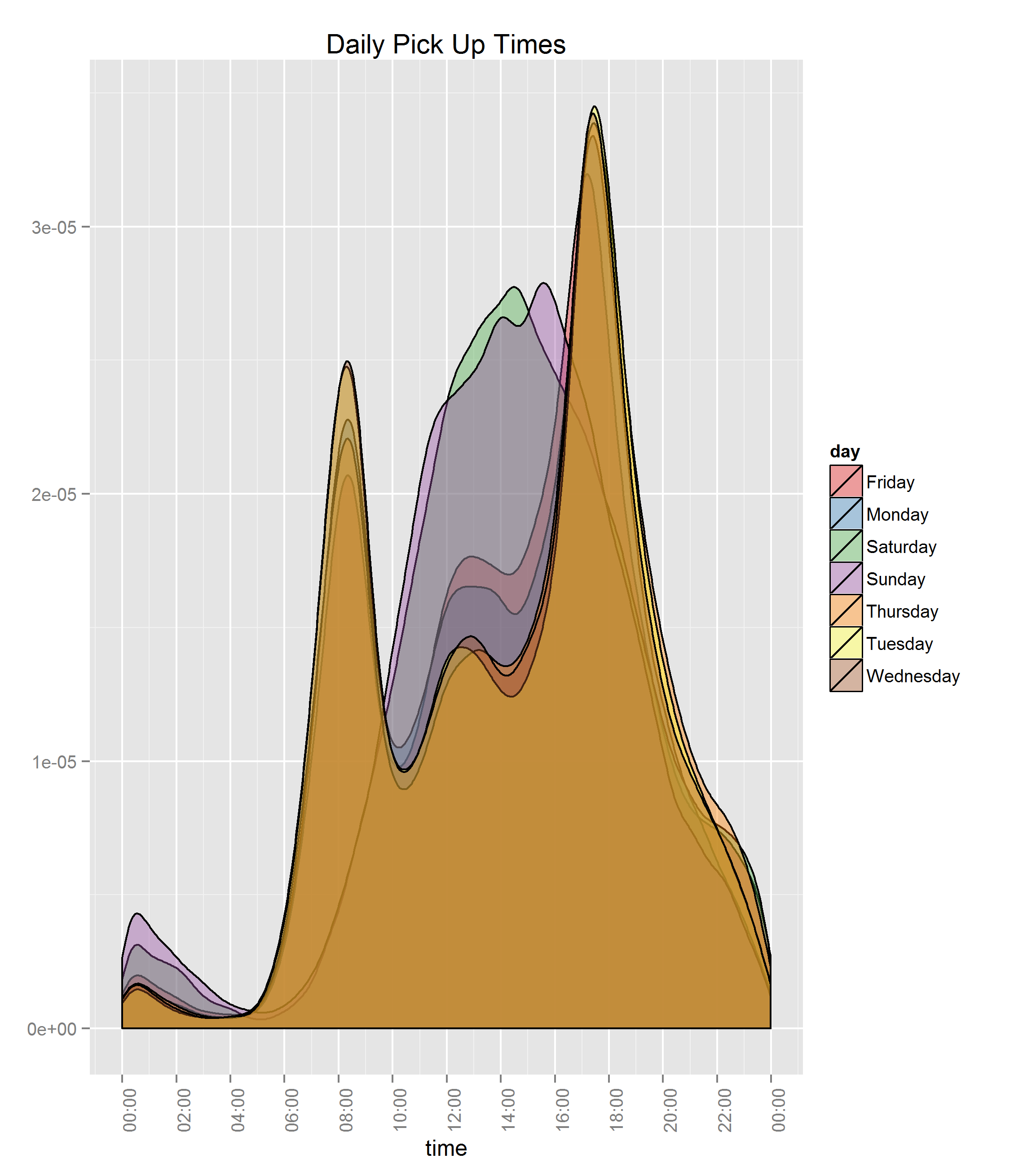
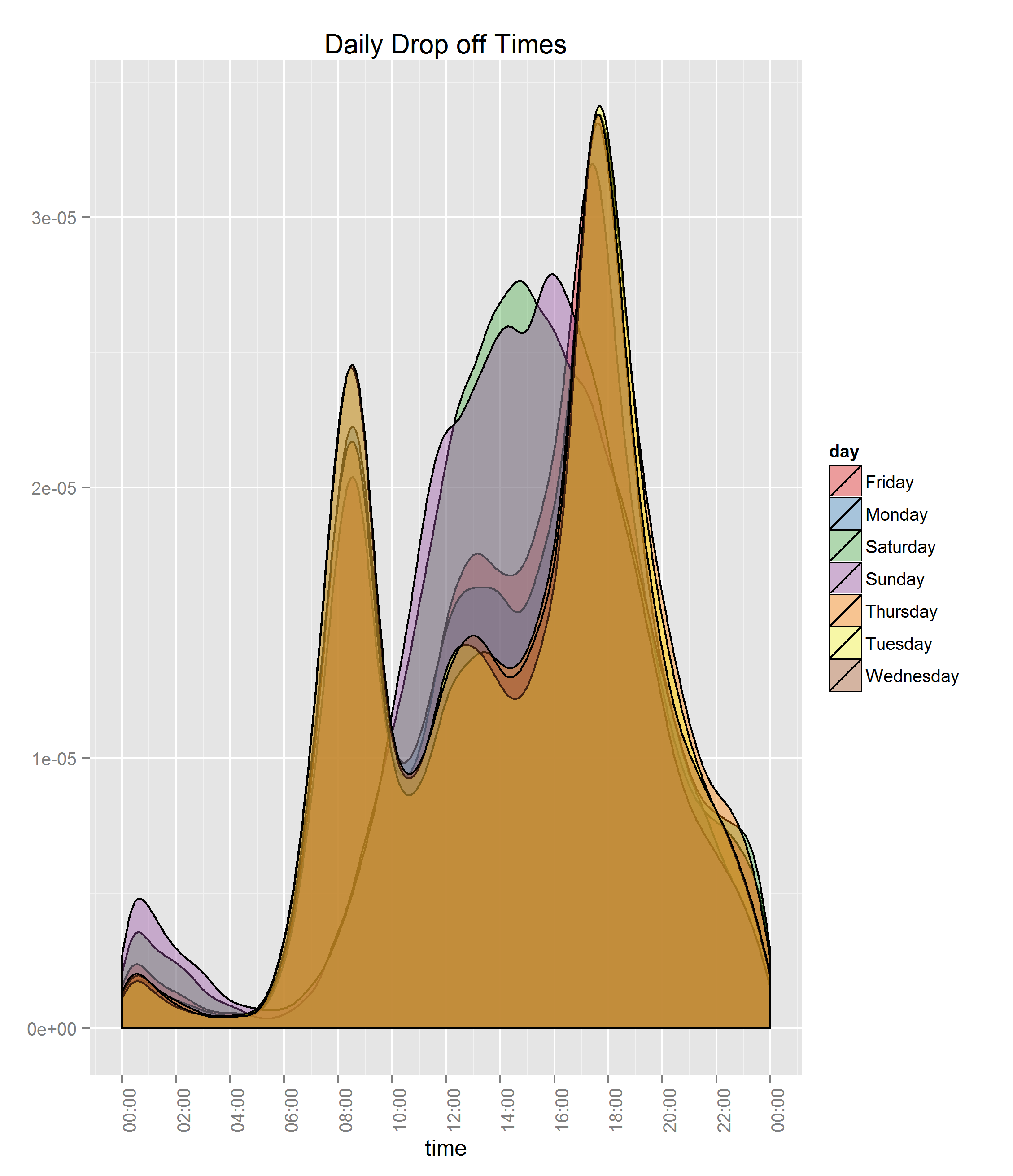
The most interesting piece I thought came from the weekday vs weekend graph. During weekdays, the ‘rush hour’ on way to or from work was the busiest where on weekends it was in during the day. People may be using this service to commute or partially commute to and from work which if true is great use of this. As well people twenty and thirty years old are primary users of this service from the Age graphs.